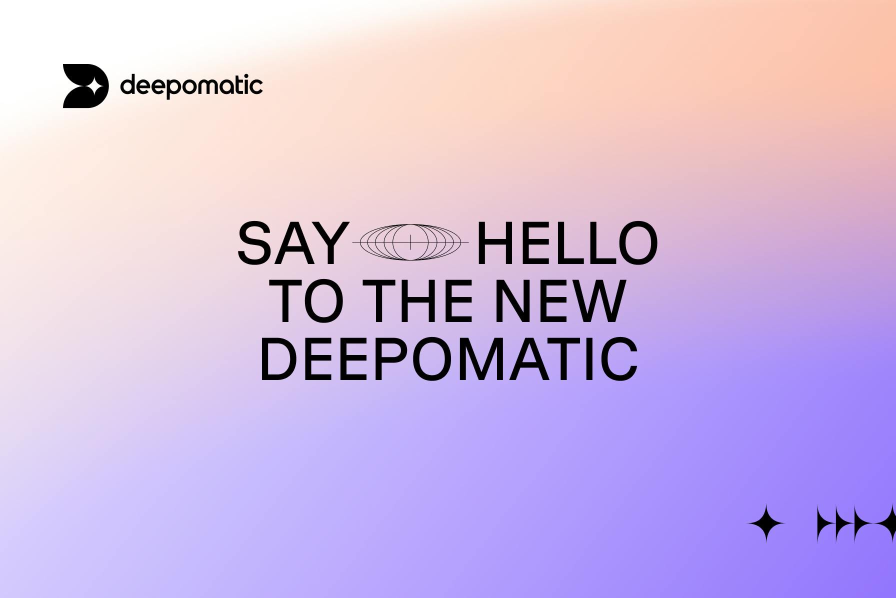
Something has changed… Unveiling Deepomatic's New Brand Identity!
To mark this 2023 back-to-school period and a few months before its 10th anniversary, Deepomatic is proud to reveal a new visual territory alongside a new logo. This work reflects a desire to refocus on strong convictions where artificial and human intelligence are combined to support quality control of field operations through first-time-right automation.
We wanted to establish the company as a leader in its field with a new logo that emphasizes the 1st letter of its name. The sparkle -or the star- that appears in the D operates as a guide. This is a symbol of instantaneity, of rapidity, that serves as a reminder of a promise that we make to our customers: to help them accelerate the deployment of their infrastructure. But a star is also a symbol of quality, which is at the heart of our mission. Therefore, with this star, you can almost hear a voice saying, 'Do it fast, but do it right.' Finally, the choice of black colour for the logo represents a solid technological solution, confident in the benefits it delivers to its clients.
The evolution of the logo comes with a new colour universe. The stark contrast of our primary colours, black and white, expresses the boldness and precision we aspire to as an organization. Our secondary colour palette is diverse and utilizes a flat hierarchy. The highly saturated colours embrace the technology used to create a digital world. Last but not least, we are excited to announce the launch of Deepomatic's brand-new website, which will be available in four languages (English, French, German, and Spanish). The Home page reinforces our positioning around First Time Right Automation with a strong message inviting visitors to discover our value proposition!
Let's discover it now.
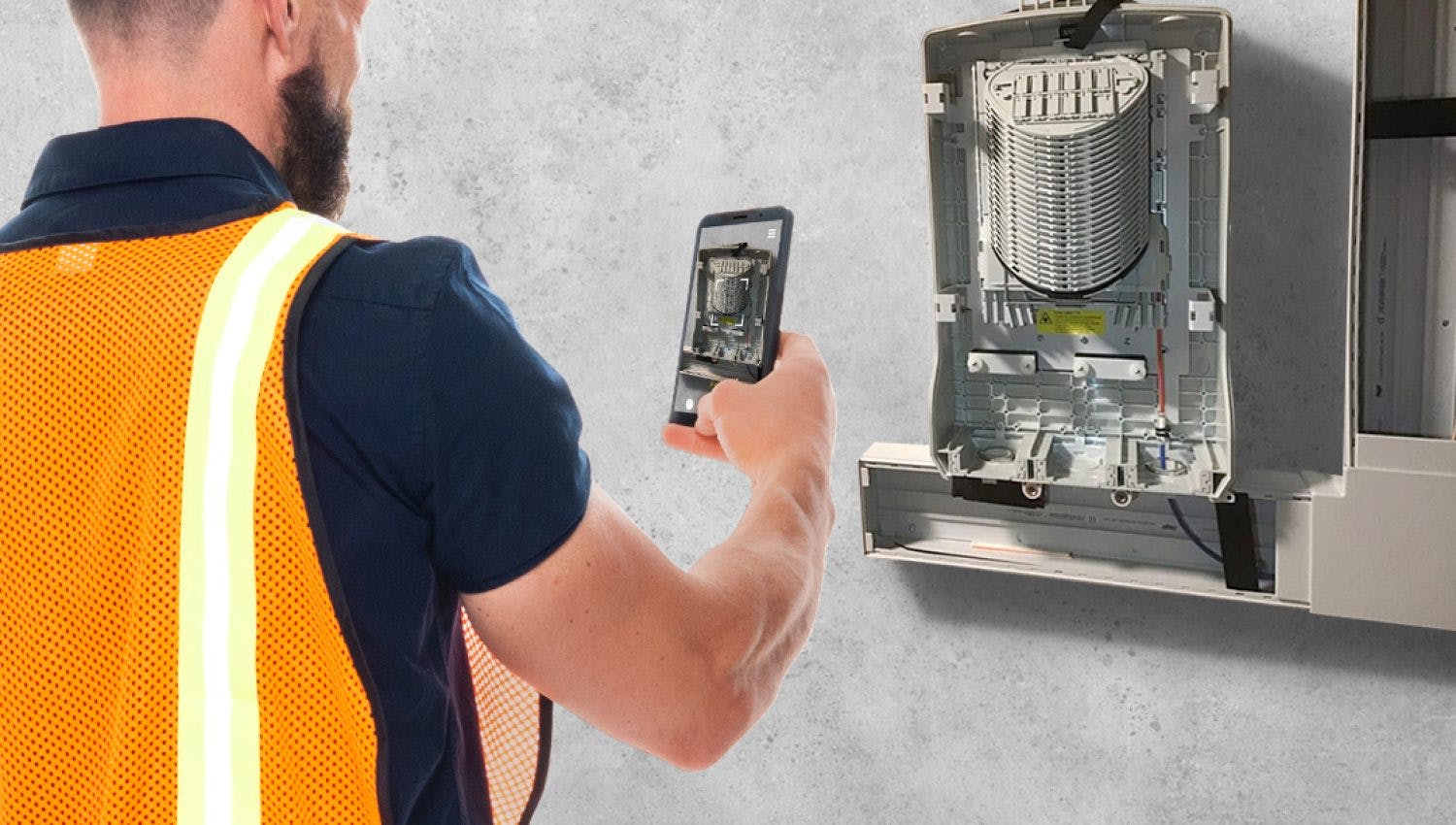
First Time Right Automation for Field Service Companies: What Efficiency Gains?
Discover how First Time Right Automation boosts efficiency in field services through real-time feedback, compliance...
28/08/2023